

our services:
quick contact:
we're on social media:
Search
People also search for:
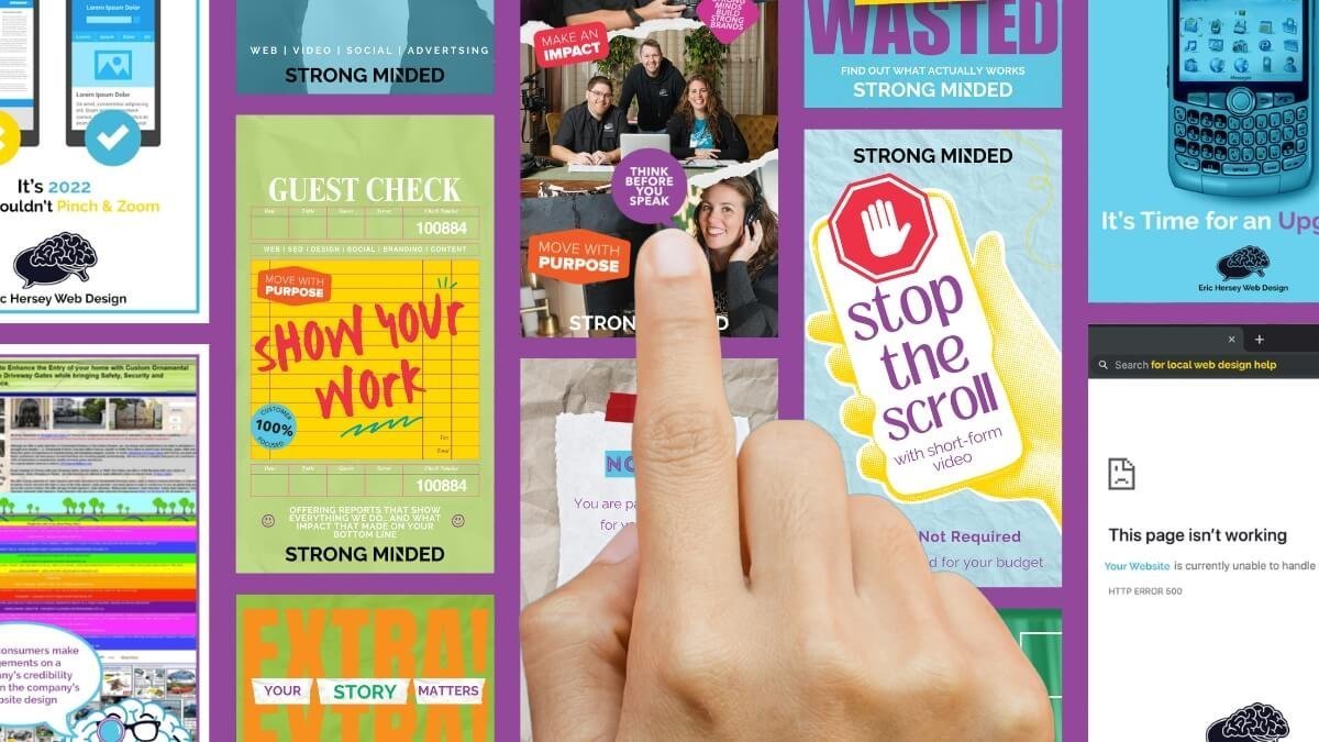
How to Stand Out in a Cluttered Chamber Email
There is nothing worse on a Friday morning than opening your inbox, clicking on your local Chamber email, and being greeted with a wall of graphics no one in their right mind is going to read.
You scroll.
And scroll.
And scroll.
Forty or fifty full-page “flyers” stacked on top of each other. Paragraphs of text. Bullet points. Logos crammed in every corner. Five different fonts fighting for attention.
After a few weeks, even the most dedicated Chamber member starts deleting before opening.
That’s not because email marketing doesn’t work.
It’s because the graphics don’t.
And if you’re a Chamber member sending in those graphics each week, this matters.
Chamber Emails Are a Huge Opportunity (If You Treat Them Correctly)
Let’s be clear.
Chamber email blasts are valuable.
- They often have solid open rates
- They go directly to business owners and decision-makers
- They are highly targeted for B2B companies
- They’re typically included as a membership benefit
In theory, this is direct access to your ideal audience.
In reality, you’re competing against 40-50 other businesses in the exact same email.
That changes everything.
Stop Thinking “Newsletter.” Start Thinking “Pinterest Board.”
Most people approach these emails like they’re designing a traditional newsletter.
They’re not.
They’re closer to a Pinterest board.
Or Netflix.
Or YouTube.
When someone opens that Chamber email, they aren’t sitting down with coffee ready to study every graphic. They’re scanning.
On desktop, they may see one or two graphics at a time.
On mobile, they see one.
Your graphic is functioning as a thumbnail, not a flyer.
And thumbnails have one job:
Make someone stop scrolling and click.
Netflix does not put the entire movie summary on a thumbnail.
YouTube creators do not explain every talking point in their cover image.
They create intrigue.
They create clarity.
They create contrast.
Then they get the click.
Why Most Chamber Graphics Fail
Here’s what usually happens.
Someone goes to Canva or Adobe and searches:
- “Event flyer”
- “Health department flyer”
- “Business flyer template”
And they get exactly that – a template built to be printed and handed out.
Then they swap in their logo and their information.
The problem?
That template was designed for:
- Printing
- Posting on a bulletin board
- Handing out in person
It was not designed to compete in a digital scroll environment.
When you cram:
- Event time
- Location
- Sponsors
- Bullet points
- Descriptions
- Dress code
- Parking info
- Pricing
- Contact info
…onto one image, you overwhelm the viewer.
And overwhelmed people scroll.
The Real Goal Is the Click
The Chamber email is not the finish line.
It’s the doorway.
The objective is simple:
Get them to your website.
Because once someone lands on your website, everything changes.
You can:
- Track where they go
- See what they click
- Retarget them with ads
- Capture their email
- Show them additional services
- Build credibility
- Measure conversions
None of that happens if you try to explain everything on the graphic itself.
If you’re hosting an event, yes – all the details matter.
But those details belong on your website.
Your graphic should spark interest, not deliver a dissertation.
Design for Scroll Behavior, Not Print Behavior
Here’s the mindset shift.
You are not designing a flyer.
You are designing a thumbnail.
That means:
1. Use One Clear Headline
Not five.
One.
Large. Bold. Obvious.
If someone glances for two seconds, they should know what this is about.
2. Limit Text Aggressively
If it feels like too little information, you’re probably close.
You are creating curiosity, not documentation.
3. Use Strong Contrast
Light gray text on a white background is invisible in a scroll.
Bold color contrast wins.
Clean backgrounds win.
Whitespace wins.
4. Have One Clear Call to Action
“Register Now.”
“Learn More.”
“Get Tickets.”
“Book a Call.”
One action. Not three.
Use the Right Templates
Here’s another major mistake.
People use the wrong template category.
Instead of searching for:
- Flyer
- Brochure
- Event handout
Search for:
- Movie poster
- Album cover
- YouTube thumbnail
- Facebook ad
- Instagram post
These are already optimized for grabbing attention.
You are shortcutting your design process by starting with something built for clicks.
Even as a professional designer, I don’t create from scratch every time. I look for layouts that already work and adapt them strategically.
If you are not a designer, starting from scratch is rarely the answer.
Start with something designed for digital attention.
Train Your Eye to Notice What Stops You
One of the simplest tactics I use is this:
If something makes me stop scrolling, I screenshot it.
Doesn’t matter what industry it’s in.
It goes into a mental (or literal) library.
When you’re on:
- YouTube
Ask yourself:
- Why did this catch my eye?
- Was it color?
- Was it typography?
- Was it simplicity?
- Was it a bold phrase?
Reverse-engineer attention.
That is far more effective than blindly filling in a template labeled “Business Flyer.”
Why This Matters for the Chamber
Here’s the bigger issue.
When Chamber emails become noise, everyone loses.
Members stop opening. Engagement drops. The value of the benefit decreases.
If more businesses focused on scroll-optimized design, the overall quality of those emails would increase – and so would the impact for everyone involved.
Better graphics don’t just help you.
They protect the effectiveness of the channel itself.
If You Want More Clicks, Think Smaller
The irony is this:
Smaller messages often perform better.
- Fewer words.
- Stronger hierarchy.
- Clearer focus.
Your goal is not to prove how much information you have. Your goal is to earn the click. And once you earn that click, your website does the heavy lifting.
If you’re currently sending full-page flyer graphics into your Chamber blast, take five minutes this week and ask:
Does this look like a handout…
Or does it look like a thumbnail?
That answer alone may determine whether people scroll past you – or stop.

Eric Hersey
Eric leads Strong Minded Agency with a focus on website strategy, SEO, analytics, and marketing direction. He helps businesses turn their ideas into clear, useful digital experiences.